
How to Make Your Home Look Expensive on a Budget
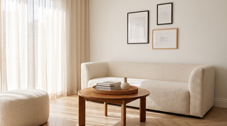
Your home does not need to cost more to look like it did.
The things that make a home look genuinely expensive are almost never the expensive things themselves. They are the visual cues of intention, order, and deliberate decision-making that expensive homes tend to have because someone paid an interior designer to create them.
What's In This Post
ToggleYou can create those cues yourself. With very little money. Sometimes with no money at all beyond the energy of doing things differently with what you already own.
I bought my home with income I built from blogging. It is not a large house and the budget for decorating it has always had to stretch. What I have learned through necessity is that the difference between a home that looks expensive and one that does not is almost entirely about decisions rather than spending.
This article is everything I know about making those decisions.
What Actually Makes a Home Look Expensive?
Before the specific changes, the underlying principle.
Expensive-looking homes share a quality of visual calm. There is space between objects. The eye can rest somewhere. Things appear to have been chosen rather than accumulated. The colours relate to each other rather than competing. The lighting is warm and deliberate rather than harsh and functional.
None of these qualities require money to create. They require intention.
The opposite is also true. The things that make a home look cheap are almost always the absence of intention rather than the presence of low-cost items. Clutter signals that decisions have not been made. Mismatched colours signal that choices happened without a plan. Poor lighting signals that the ambiance of the space was never considered.
You can have inexpensive furniture in a beautifully considered space and it looks expensive. You can have genuinely expensive furniture in a space without intention and it does not.
Start with the intention. The specific changes follow from it.
The 3-5-7 Rule for Decorating
This is one of the most useful principles in interior styling and it applies directly to making a home look more expensive.
When styling a surface, a shelf, or a vignette, arrange objects in groups of odd numbers. Three, five, or seven objects together create visual interest in a way that even numbers do not. Two objects feel symmetrical and static. Three objects feel dynamic and intentional.
Within the group, vary the heights. One tall object, one medium, one low. The eye travels through a group of objects at different heights in a way that feels natural. Objects at the same height feel like they were placed without consideration.
Vary the shapes and textures within the group as well. A round object, a rectangular one, and a textural one create more interest than three objects of the same shape.
This single principle applied to every surface in your home changes how the home looks without changing what is on the surfaces. The same objects, arranged with this intention, look curated rather than accumulated.
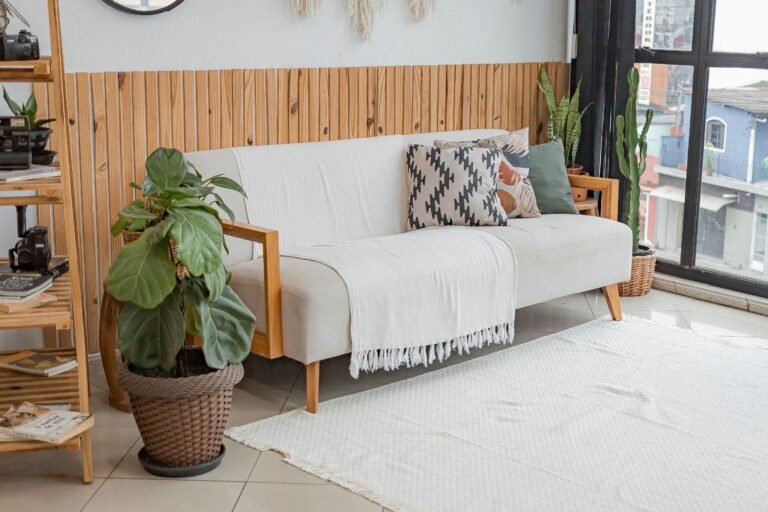
20 Ways to Make Your Home Look Expensive Without Spending Much
1. Remove before you add
This is the most important and the most free change available.
A room with fewer objects in it looks more expensive than the same room with more objects. Every time you think the room needs something new, first spend ten minutes removing things and see whether the room looks better.
The answer is usually yes.
Decluttered surfaces, fewer decorative objects competing for attention, and negative space where the eye can rest all signal the quality of restraint that expensive homes consistently have.
Do this before any purchase. It costs nothing and it often eliminates the need for the purchase entirely.
2. Change the curtains or hang them higher
Curtains are one of the highest-impact changes available in any room and they are frequently the source of the most obvious visual problem.
Curtains that end at the windowsill look like an afterthought. Curtains that fall to the floor look deliberate and elegant regardless of the fabric they are made from.
Hang the curtain pole or track as close to the ceiling as possible, not at the top of the window frame. Then use curtains that are long enough to fall to the floor with a slight break. This creates the impression of a taller room and more generous window than either actually are.
The width matters too. Curtains that barely cover the window when closed look meagre. Curtains with enough fabric to gather and drape when open look genuinely luxurious even in inexpensive fabric.
Amazon search: Floor length curtains, eyelet curtains linen look, velvet curtains budget.
3. Replace the lampshades
Lampshades are inexpensive to replace and they have a disproportionate impact on how a room looks.
A worn, stained, or yellowed lampshade makes the entire lamp look neglected. A fresh lampshade in a neutral fabric, a drum shade, a pleated shade, or a simple linen shade makes the same lamp base look current and intentional.
The shape of the shade matters. Drum shades, straight cylinders, look more contemporary and more expensive than the tapered or empire shades that came with many basic lamp bases.
Amazon search: Drum lampshade neutral, linen lampshade small, fabric lampshade bedroom.
4. Add a large mirror
A well-placed large mirror does three things simultaneously. It makes the room feel larger. It reflects light and makes the room feel brighter. And it adds a statement piece that reads as a deliberate and expensive-looking design choice regardless of what the mirror actually cost.
A mirror above a fireplace or a console table. A full-length mirror leaned against a wall in a bedroom. A round mirror as a focal point in an entrance hallway.
The frame matters. A thin gold frame, a chunky black frame, or a natural rattan frame all look more expensive than a plain silver or chrome frame.
Amazon search: Large wall mirror black frame, round mirror rattan, arched mirror budget.
5. Switch to matching hangers
This one costs very little and applies to a space almost nobody else will see. And somehow it still matters.
Opening a wardrobe where every item hangs from the same type of hanger produces a quality of visual calm that a wardrobe of mixed hangers does not. The uniformity reads as intentional. The mixture reads as accumulated over time without any plan.
Velvet hangers in a neutral colour are slim, do not allow clothes to slip, and look genuinely premium. A set of thirty costs less than a meal out.
Amazon search: Velvet hangers black set, slim velvet hangers neutral, non-slip hangers bulk.
6. Use paint strategically
Paint is the lowest cost per square metre of any change you can make to a room and it has the highest visual impact.
A single accent wall in a deep, considered colour changes the character of an entire room. An alcove painted in a contrasting or complementary tone creates the impression of a built-in and designed space. Painting skirting boards and door frames in a high-gloss white or a contrasting colour adds the crispness that expensive rooms have.
Painting existing furniture is also worth considering. A dated dresser in a dark wood painted in a chalky neutral or a sophisticated dark colour looks entirely different and entirely current.
The colours that make a home look expensive:
Warm whites and off-whites like warm cream, warm white, and linen tones rather than bright stark white which can feel cold and clinical.
Deep warm neutrals like camel, warm taupe, and warm greige that feel considered and current without being trendy.
Deep, saturated tones used in specific rooms or on specific walls. Navy, forest green, terracotta, deep burgundy. These colours signal confidence and intention in a way that beige on every surface does not.
Matching the walls to the woodwork in the same tone creates a contemporary look that feels deliberately designed rather than decorated in stages.
7. Style your shelves with intention
A shelf covered in objects placed where they fit looks like storage. A shelf styled with intention looks like design.
The principle is simple. Group objects in odd numbers. Vary heights. Include a plant or greenery. Leave some empty space. Lean something against the wall at the back. Include different textures alongside books.
Books can be organised by colour rather than subject if the shelves are decorative rather than primarily functional. This creates a cohesive visual effect that reads as intentional rather than random.
Remove everything from the shelf first. Then replace only the things that genuinely belong there and that contribute to the look you are creating. The rest can find another home or be released entirely.
8. Upgrade your soft furnishings
Cushion covers, throws, and towels are the textiles that most directly and most affordably change the look and the feel of a room.
New cushion covers on the same sofa cushions update the sofa without replacing it. A quality throw draped on a chair or at the end of a bed adds texture and warmth in a way that the room itself cannot produce.
The key is choosing textiles in colours that work together rather than competing. One throw and cushions that are from the same colour family as the rest of the room rather than from a completely different palette.
Linen, velvet, boucle, and woven textures all look more expensive than plain polyester regardless of the actual price.
Amazon search: Linen cushion covers neutral, velvet cushion covers budget, textured throw sofa.
9. Introduce plants
A living plant in a room does something that no decorative object can replicate. It introduces life, movement, and a quality of freshness that signals that the space is cared for.
The size of the plant matters. One large statement plant in the corner of a room makes more visual impact than several small plants scattered across surfaces. A fig tree, a monstera, a large peace lily. Something that commands the corner without requiring daily attention.
The pot matters as much as the plant. A plastic nursery pot in a quality ceramic or rattan pot costs almost nothing and looks significantly more expensive than the pot the plant arrived in.
Amazon search: Large indoor plant pot neutral, rattan plant stand, ceramic plant pot large.
10. Replace or upgrade door handles and cabinet hardware
This is one of the most underrated budget upgrades available.
Brass, matte black, or brushed nickel handles on kitchen cabinets, bathroom cabinets, and interior doors change the appearance of those surfaces immediately and dramatically relative to the cost.
Standard chrome or silver handles are functional. Matte black or brushed brass handles are a design choice. That distinction is visible and it changes how the entire kitchen or bathroom reads to someone walking into the room.
Amazon search: Matte black cabinet handles, brushed brass drawer pulls, gold kitchen handles set.
11. Use lighting properly
Overhead lighting is functional. It illuminates a room adequately. It does not make a room feel warm, luxurious, or anything other than functional.
Lamps do something different. The light from a lamp is directional, warm, and atmospheric in a way that ceiling lighting cannot be. A room with lamps rather than only ceiling lighting feels categorically different from the same room with only overhead light.
The goal is layered lighting. Overhead for function. Lamps for atmosphere. A specific light source for task areas where needed.
Changing a lightbulb to a warmer colour temperature, 2700K to 3000K rather than 4000K and above, immediately makes a room feel warmer and more expensive without changing the lamp or the fitting.
Amazon search: Table lamp budget neutral, warm white LED bulbs, floor lamp for living room.
12. Frame and hang art properly
Unframed prints or posters leaned against a wall, or hung too high, or in frames that are too small for the wall space, all make the art look like an afterthought.
Art hung at eye level, in frames that are appropriately sized for the wall, arranged as a considered grouping rather than scattered individually across a large wall, looks deliberate and well-considered.
Gallery walls done properly, with frames that are related to each other in colour or style even if the content varies, look genuinely expensive. Gallery walls with completely mismatched frames and random spacing look chaotic regardless of the quality of the art inside them.
You do not need to spend significant money on art. A print that costs very little in a quality frame looks entirely different from the same print in a cheap frame. The frame is the investment.
Amazon search: Black picture frame set multiple sizes, white frame gallery wall set, poster frame A3.
13. Keep the entrance looking intentional
The entrance to a home is where the first impression is formed and it is frequently the most neglected area.
A clean doormat that fits properly, not too small. Shoes contained rather than scattered. Somewhere for bags and keys that is specific and maintained. A mirror on the wall. A plant or a small decorative element.
Five minutes of attention to the entrance area changes the first impression of the entire home.
Amazon search: Quality doormat neutral, entryway organiser hooks, console table for hallway.
14. Address the skirting boards and architraves
Skirting boards and door frames that are painted in a high-gloss white and properly maintained give a room a crispness that is difficult to achieve any other way.
Skirting boards that are scuffed, yellowed, or painted in the same flat emulsion as the walls look unfinished. High-gloss white skirting and door frames, properly masked and painted, make a room look significantly more polished.
This is a weekend project and the paint costs very little.
15. Style the bathroom like a hotel
Rolled or neatly folded fresh towels rather than towels shoved onto a towel ring. A small tray that organises soap, hand lotion, and whatever is on the bathroom counter. A plant or a small piece of art on the wall. Matching dispensers rather than the various mismatched product bottles that accumulate on most bathroom surfaces.
These changes take twenty minutes and make a bathroom look entirely different.
Amazon search: Bathroom tray organiser, soap dispenser matching set, bathroom basket storage.
16. Use colour cohesively
A home where every room is a completely different colour palette and where the furniture and textiles in each room are from completely different colour families looks like a series of disconnected decisions rather than a home.
Choosing a limited palette of three to five colours and using them consistently throughout the home in different proportions creates a visual coherence that reads as intentional and designed.
The neutral base, the accent colour, and the metallic finish. Using these three elements consistently across rooms in different proportions creates a home that feels considered from the entrance to the back bedroom.
17. Add architectural interest with paint
Panelling painted onto walls rather than installed physically costs a fraction of the real thing and can produce a similar visual effect.
Tape applied directly to the wall in a grid or rectangular pattern, painted in a contrasting or complementary colour, then the tape removed, creates painted panelling. This technique works particularly well in hallways, dining rooms, and bedrooms.
It is an afternoon project and the result looks significantly more expensive than the effort or cost involved.
18. Group small objects into trays
A collection of small objects scattered across a coffee table or console table looks messy. The same objects collected into a tray look curated.
A tray imposes a boundary on the grouping. Everything inside the tray belongs together. Everything outside the tray has a different purpose. This simple visual distinction transforms a collection of clutter into a styled vignette.
Amazon search: Decorative tray neutral, serving tray for coffee table, rattan tray styling.
19. Keep surfaces clear except for what is intentional
Return to the first principle. Remove before you add.
A kitchen counter with the minimum of necessary objects looks clean, calm, and expensive. A kitchen counter with every appliance and every jar and every miscellaneous item that has arrived there over months looks overwhelmed.
Put the appliances that are not used daily away. Store things in the cupboards they belong in rather than on the surface where they are accessible. A surface with three intentional objects looks expensive. A surface covered in fifteen objects does not.
20. Invest in one good thing per room
Rather than filling a room with many average things, choose one genuinely good piece per room and build around it.
The quality lamp. The beautiful throw. The good mirror. The statement plant. One thing that is noticeably better than everything around it lifts the perceived quality of everything around it.
The eye finds the best thing in a room and uses it to calibrate its assessment of everything else. Give the eye one genuinely good thing to find.
What Makes a Home Look Cheap: 10 Things to Address
1. Curtains that are too short. The skirting-board curtain is the single most common home styling mistake and the one with the most immediate fix.
2. Surfaces covered in too many things. Clutter signals the absence of decision-making. Every surface that is covered in accumulated objects rather than intentional ones reads as unmanaged.
3. Mismatched frames on the same wall. A gallery wall with frames in different metals, different colours, and different thicknesses looks chaotic rather than curated.
4. Bare bulbs or exposed fittings. Lighting without a considered shade or fitting signals that the room was not designed, it was simply lit.
5. Art hung too high. The standard gallery hang height is at eye level. Art hung significantly above eye level disconnects from the viewer and from the room.
6. Small rugs in large rooms. A rug that is too small for the seating area floats in the middle of the room rather than anchoring the furniture. The rug should be large enough that at least the front legs of all the seating are on it.
7. Mismatched bedding. A duvet cover in one pattern with pillowcases in a different pattern and a throw in a third pattern looks like bedding was assembled from whatever was available. A cohesive bed in one colour family looks intentional.
8. Unpainted or unfinished walls. Walls with unfilled holes, chipped paint, or marks that have accumulated create a background that undermines everything placed against them.
9. Plastic storage solutions that are visible. Plastic bins, wire baskets, and utilitarian storage left visible rather than contained in furniture reduces the overall look of the room immediately.
10. Things left where they do not belong. The ironing pile that has been on the chair for a week. The bag left at the bottom of the stairs. The collection of things on the kitchen counter that belong in another room. Each of these signals a home that is not maintained with intention.
How to Make Your Living Room Look Expensive on a Budget
The living room is the room that benefits most from the combined application of these principles because it is the room that makes the strongest impression.
Start with the sofa. If the sofa is dated but structurally sound, new cushion covers and a quality throw change its appearance dramatically. Sofa covers, while not always the most aesthetically elegant solution, can also transform a tired sofa.
Address the curtains. If there is one room where the floor-length curtain hung from ceiling height matters most, it is the living room.
Create one focal point. A gallery wall. A large mirror. A statement light fitting. A beautifully styled shelving unit. One focal point around which the rest of the room is organised rather than a room where the attention is pulled in multiple directions without resolution.
Use the tray principle on the coffee table. One tray containing a candle, a small plant, and one or two books or objects. The coffee table as a styled surface rather than a landing area for whatever arrives there.
Add a large rug. If the room does not have one. If it does, ensure it is large enough that the furniture sits on it rather than floating separately from it.
Improve the lighting. Add a floor lamp to a corner. Replace a lampshade. Add a table lamp to a side table. Layer the light rather than relying on a single ceiling source.
My Simple Philosophy for an Expensive-Looking Home on a Budget
I do not have an interior design budget. What I have is an eye that has learned what makes the difference and hands that are willing to implement it.
The homes I admire when I encounter them are not always the expensive ones. They are the ones where every decision feels considered. Where the objects on the shelf were chosen rather than accumulated. Where the colours relate to each other. Where the lighting is warm. Where there is enough empty space that the things present can be appreciated.
Creating that quality of consideration costs almost nothing except attention and the willingness to remove things as readily as you add them.
Buy less. Choose better. Arrange with intention. That is the entire philosophy.
With love,
Nia
FAQ
What is the 3-5-7 rule for decorating?
The 3-5-7 rule refers to arranging objects in groups of odd numbers, three, five, or seven, because odd groupings create more visual interest than even ones. Within each group, vary the heights of objects so the eye travels naturally through the arrangement. This principle applies to shelf styling, coffee table vignettes, and any surface where objects are grouped together.
What are things that make a home look cheap?
The most common ones are curtains that end at the windowsill rather than the floor, surfaces covered in accumulated clutter, mismatched frames on the same wall, art hung too high, rugs that are too small for the room, bare or low-quality light fittings, mismatched bedding, and visible utilitarian storage. Most of these are free to address.
What colour makes a house look expensive?
Deep, saturated tones used with confidence, navy, forest green, terracotta, deep burgundy, signal intentional design rather than cautious decorating. Warm whites and off-whites rather than stark bright white create a softer and more considered background. Matching walls to woodwork in a contemporary tone reads as designed rather than decorated. The key is choosing a limited palette and using it consistently rather than applying a different colour approach in every room.
How do you make a home look expensive without spending much?
Remove things before adding anything. Hang curtains from ceiling height with enough length to reach the floor. Replace lampshades. Add a large mirror. Style shelves with odd-number groupings. Upgrade cabinet handles. Use layered lighting with lamps rather than only overhead light. Group small objects into trays. Keep surfaces clear except for intentional items. Choose one genuinely good piece per room and build around it.
How do I make my living room look expensive on a budget?
New cushion covers and a quality throw update a tired sofa. Floor-length curtains hung from ceiling height change the proportions of the room. One focal point, a mirror, a gallery wall, a statement lamp, around which the room is organised. A tray on the coffee table turning a landing area into a styled surface. A large enough rug that the furniture sits on it. Layered lighting from multiple sources rather than a single ceiling light.
How do I make my house look nice inside?
Clear the clutter from surfaces before adding anything. Choose a colour palette and use it consistently across rooms. Ensure lighting is warm and layered rather than purely functional. Hang curtains at ceiling height. Keep things in their places so the home looks maintained rather than in the middle of being managed. Invest in one good thing per room rather than many average things.